디자인 Kit
브랜드 키트, UI 리뷰, 핸드오프 노트.
Design Studio Kit
Brand kits, scored critiques and launch checks so AI-built UI stops looking generic.
사용 전: Orbit, product analytics for B2B teams. Our Lovable-built pricing page looks like every other AI startup, and our one designer is part-time. We want it fixed and kept fixed.
사용 후: Pricing page: 18/35 to 25/35 in two weeks, from Rework to Fix then ship. Week 1: Orbit v1.0 brand kit shipped as Tailwind tokens; the first Friday review set the baseline. Week 2: muted text fixed (3.75 to 6.96:1) and one primary button, both Effort 1 fixes. Week 3: the dot caught an off-brand launch image before it was resized. Design debt: 7 issues opened, 6 closed. Brief to approved page: 3 days.
Design Studio Bot
A Grok teammate that scores your live pages every Friday and drafts the fixes.
사용 전: Routine: Weekly design review, Fri Oct 9, 3:00 PM America/New_York. Four URLs from the Notion review list: home, pricing, onboarding (staging), settings (staging).
사용 후: Pricing up 7 to 25/35, home 29/35, onboarding new at 20/35 (Rework). New blocker: onboarding "Continue" is #FFFFFF on #8B5CF6, 4.23:1, and violet is off-brand (expected --primary #C2410C, 5.18:1). Not reviewed: settings, login required. Drafted: a #design post and 3 Linear issues. DECISION: approve all, Slack only, issues only, or skip?
Design Studio Dot
Your dot checks every launch asset against your brand kit before it ships.
사용 전: New in Google Drive, Launches/Lumen 2.0: lumen-2-og.png. Priya in #launch-lumen-2: "OG image is final! Can someone resize it for X and LinkedIn?"
사용 후: Fix then ship (3 Off-brand, 2 Drift). The headline is Playfair Display 700, not Instrument Serif; white text over bright sky is about 1.9:1 [check]; "Used by 12,000 photographers" has no source [confirm]. Resizing is on hold. DECISION: reply in Priya's thread with the fixes? Draft ready. Needed by 12:00 PM America/Los_Angeles.
Design Studio Skill
Brand tokens, page specs and scored critiques that stop AI-built UI looking generic.
사용 전: Our hero, built in v0: violet-to-blue gradient, centered H1 "Supercharge Your Workflow", subhead #94A3B8 on the gradient, two pill buttons, six emoji feature cards below. Does this look AI-made?
사용 후: Score: 15/35 Verdict: Rework Generic tells found: violet gradient, everything centered, card soup, emoji icons, hype copy. 1. Accessibility: subhead #94A3B8 on #7C3AED is 2.22:1. Fix: solid #FBFAF7 hero, subhead #5A635E (5.95:1). Priority 9 2. Hierarchy: two equal pill buttons. Fix: one bg-primary button, the other a text link. Priority 9 3. Color: drop the gradient; one flat primary, for actions only. Priority 6
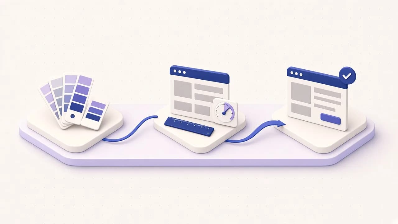
디자인 Kit은 짧은 브리프를 브랜드 키트, 페이지 스펙, 컴포넌트 스펙으로 바꾸고, 명확한 평가 기준으로 화면을 리뷰하며, 핸드오프 노트까지 작성해요. 뻔한 AI 디자인 티가 나지 않도록 만들었어요.